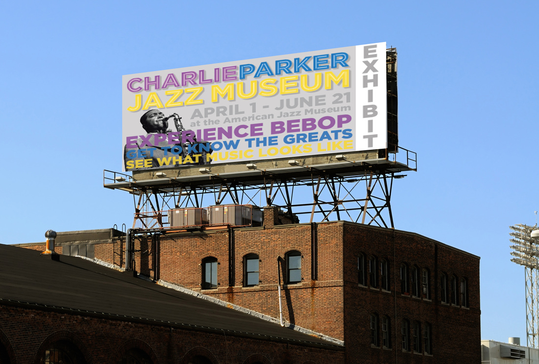
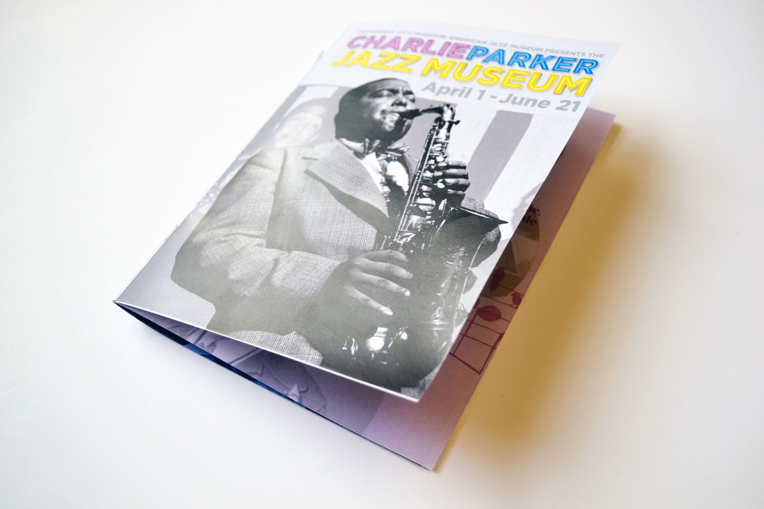
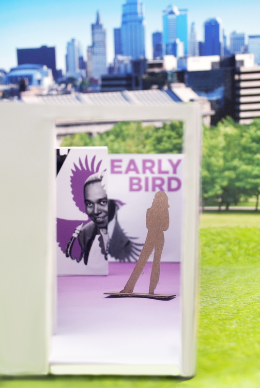
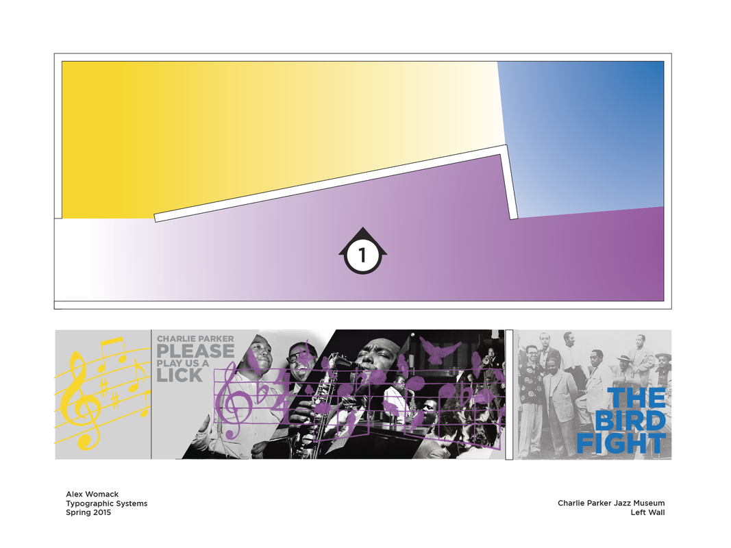
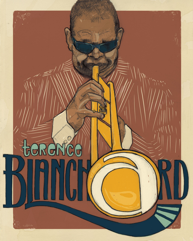
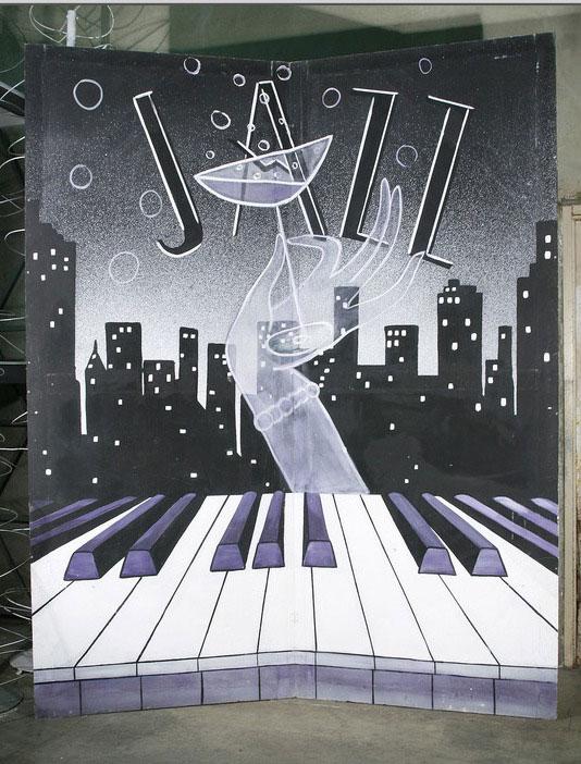
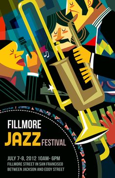
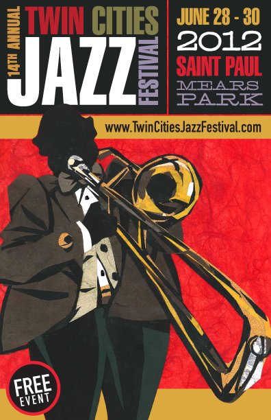
Images that resonate with me from Thinking Form
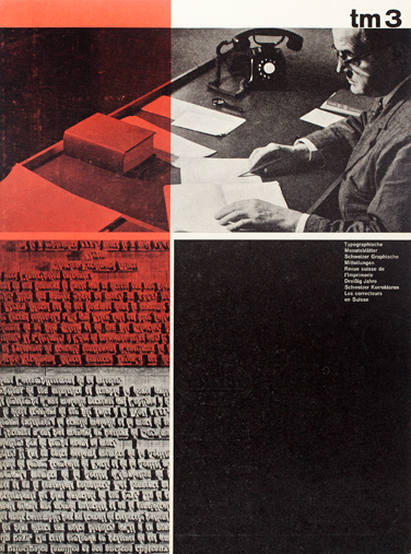
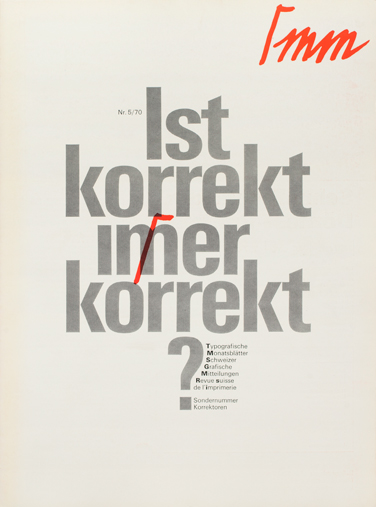
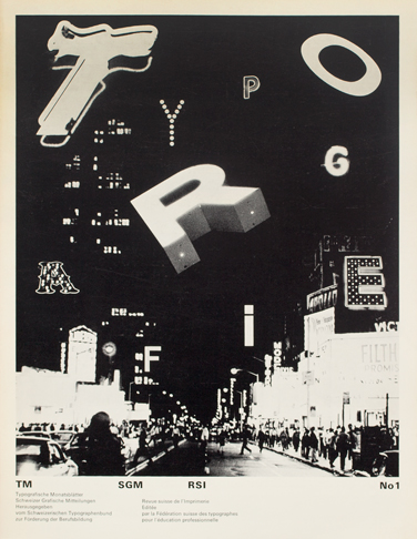
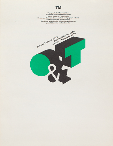
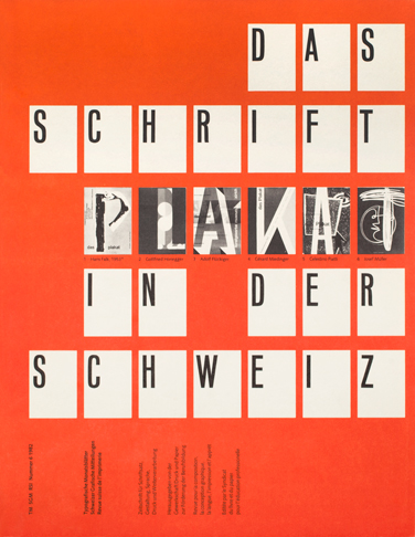
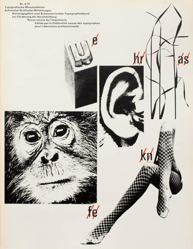
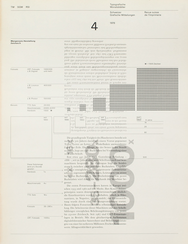
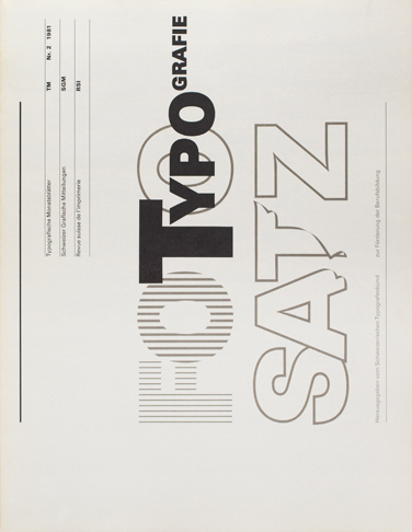
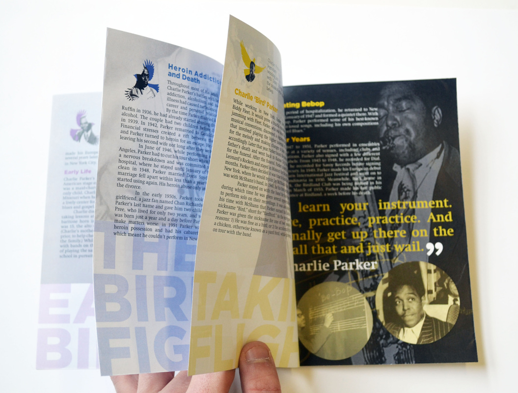
| The spread below uses color block well to highlight parts of images and text in an interesting way. Calabresi's use of grid is experimental and appealing to the eye as elements move the reader across the page from top left to the bottom right. 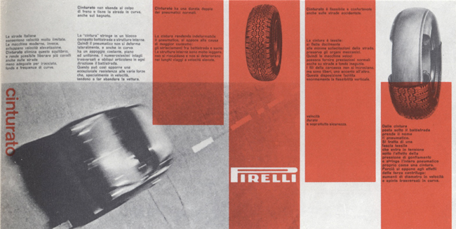 Aldo Calabresi was born on 05 21 1930 in Switzerland. He studied at the Kunstgewerbeschule in Zurich from 1946 to 1950. While he studied at Kunstgewerbeschule, he apprenticed to Fretz Bros, AG, printer. After he finished his diploma he worked as a designer in advertising department of the Zurich branch of PKZ from 1950 to 1951. He worked in the studio of Gérard Miedingerin Zurich from 1951 to 1951. He went to Paris for 6 months to work as a freelancer. In 1954, he worked at the Studio Boggeri in Milan, where he get a well reputation. His worked was exhibited in the "Ten Milan Designers" in New York. Rand's layouts below are fairly simple and convey a feeling of war due to his use of type and imagery. An almost Bauhaus style is created when the type is tilted. 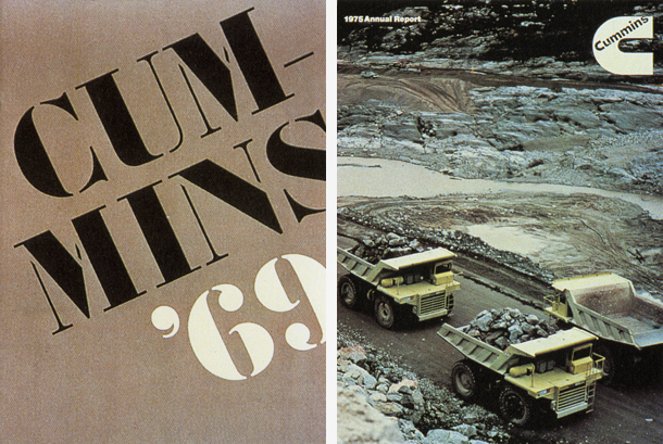 Paul Rand was born in Brooklyn, New York on August 15, 1914. Paul Rand took some classes in Pratt Institute at night after attending Harren High school. He continued his study in Parson School of Design and the Art Students League. He was highly influenced by Cassandre and Moholy Nagy. His inspirations come from European magazines, Gebrauchsgraphik. Paul Rand is one the most famous graphic designers. Many people may not known who Paul Rand is but his corporate identity such as IBM, EF, and ABC is well known around the world. At the age of 23, He became an art director for Esquire’s fashion pages. Burri's use of imagery reminded me that burried within typography we can find interesting elements of design like perpective and direction. The top image caught my eye as I imagined slanted type overlaying the negative space the compliment the directions which people move and are facing. 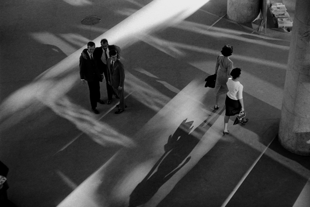  René Burri was born on the 9th of April 1933 in Zurich, Switzerland. He started his education at the Zurich School of Arts and Crafts under Hans Finsler who gifted Burri his first Leica camera. The strict formalist of Finsler's style still influence Burri's work. He also learned typography course under typographer Alfred Willimann for three-year-long course. In 1955, He worked with Magnum agency,a first prime agency for photojournalist worldwide founded by Robert Capa, David Seymour, Henri Cartier Bresson, George Rodger and William Vandivert. In 1959, Burri became a full member. Burri has took many influence people in their field such as Winston Churchill, Le Corbusier, Picasso and many others. The most prominent was Che Guevara puffing on cigar where the images has been reproduced on countless t-shirts, postcards, books and many more. "people think I became millionaire with that photo-but I didn't get a thing from everyone who used it on matches, T-shirts and wine bottles." | The images below created by Hiebert drew my eye with the expirimental use of type and imagery that creates a collage-like composition where heirarchy is based on the scale of various elements on the page. 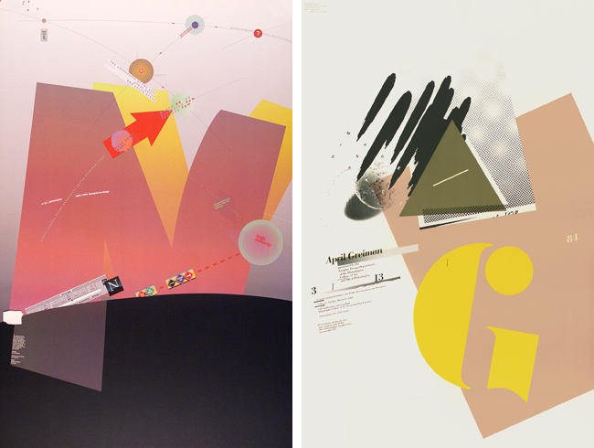 Kenneth Hiebert was born in Minnesota on December 20, 1930. He received the B.A. degree in social studies from Bethel College, Kansas, in 1953. From 1959–64 he studied under Kurt Hauert, Armin Hofmann and Emil Ruder at the Allegemeine Gewerbeschule Basel in the “Fachklasse fuer Grafik” (Basel School of Design, Class for Graphic Design). He taught briefly at the School of Design, Basel, then at Carnegie Institute of Technology, and from 1966–1999 at what is now The University of the Arts where he was founding chairman of the graphic design department. He retired Professor Emeritus in May 1999. In Spring 2001 he held the Nierenberg Distinguished Chair in the School of Design at Carnegie Mellon University, conducting research on the relation of interpretive visual kinetic imagery as an extension to composed, contemporary musical form. In 1973 he was Research Associate in the Arts at Yale University, leading an investigation of latent pattern in vernacular store fronts. He instigated the universal/Unique symposium and invitational exhibition at the University of the Arts in 1988. He received the Mary Lou Beitzel Award for Distinguished Teaching in 1990 and the Master Teacher Award of the national Graphic Design Education Association in 1991. Honorary degrees were awarded by the Maine College of Art in 2002 and the University of the Arts in 2013. Martin's use of bold, lowercase type on the left is interesting because of compositional choices and hyphenation choices. The overlayed image is used to compliment the type and break it apart. The middle image uses opacity to create energy. 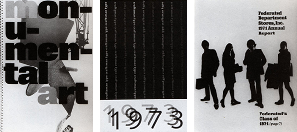 Noel Martin was born in Syracuse, Ohio on 19 April 1922. He studied drawing, painting, and printmaking at Art Academy of Cincinnati from 1939-41. He was self though in typography and design. Later on, he became an instructor at Art Academy of Cincinnati until 1957. Noel Martin became the first graphic designer to work for Cincinnati Art Museum. He had major one-man exhibition in USA and Canada. In 1953 he was included in "Four American designers" , along side with Herbert Bayer, Leo Lionni and Ben Shahn. He had many awards including Art Director's Medal, Philadelphia 1957 and Sachs Award, Cincinnati, in 1973. The images below resonated with me the most only because they have a truly modern feel. Milani's minimalist style is one I can relate to because hey uses only key elements to create successful design. The top images contain nicely kerned type elements accompanied by clean photography. The calenders are very minimal in Type and Imagery use and altogether create a nice set. The bottom image was the most inspiring as Milani uses imagery to create comparisons with everyday shapes and type shapes. 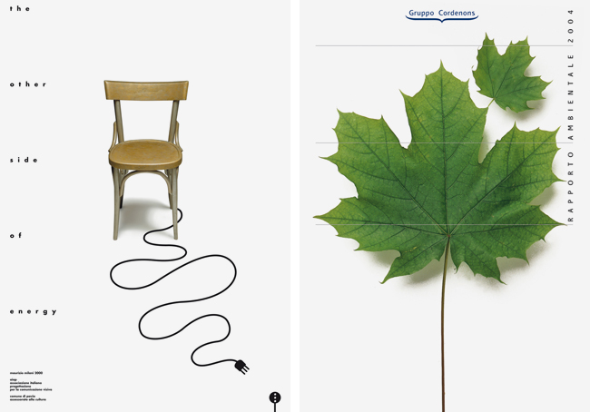 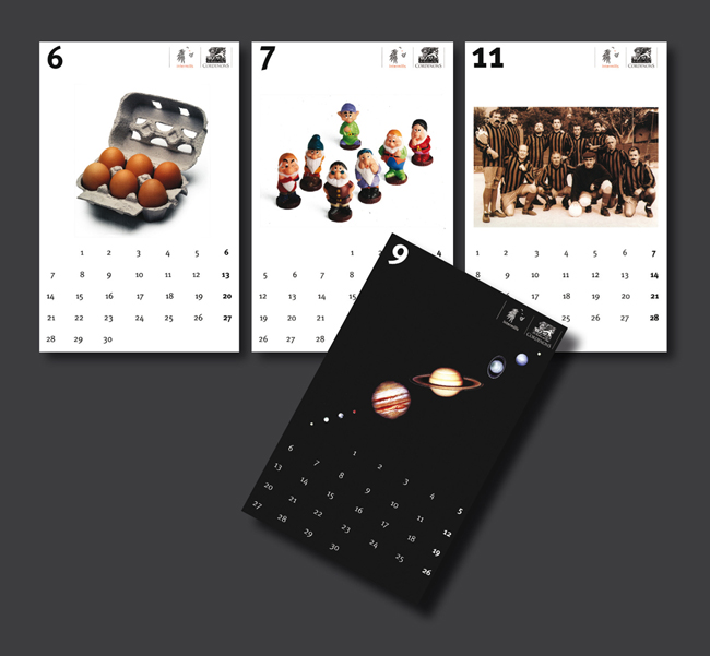 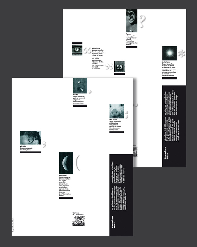 Maurizio Milani was born in Milan in March 02 1955, studied graphic design under Albe Steiner at the Società Umanitaria. In 1976 he and his brother Armando Milani founded their own graphic design company. He specialised in corporate identity and signage, since 1981 when he also began to teach. He initially gave courses in Graphic Design at the Società Umanitaria then moved on to teaching at the Istituto Europeo del Design. At present he teaches Corporate Identity and Signage Programmes at the Accademia di Comunicazione and Industrial Design for Visual Communication in the 3rd Architectural Faculty of the Politecnico di Milano. He lectured at a variety of conferences and masters programmes including those at Università del Progetto di Modena, the Istituto Europeo del Design in Rome, the Master TdC Fashion of Tessile di Como, the Northern Illinois University of Chicago and in numerous other institutions and business. He created the corporate image for Gruppo Zerowatt, Gruppo Cartario Cordenons, Tessile di Como, Federazione Italiana Malattie Polmonari Sociali, Gruppo Italtel, Gruppo Enimont, for the Property Developers Pietro Mezzaroma and Rione Rinascimento and the signage programmes for Italtel, IEO European Institute of Oncology, Snam, Tessile di Como, Fondazione Policlinico and Ospedale Niguarda in Milan. His works have been published in the most important italian and international graphic magazines. The achievements of Maurizio Milani have been celebrated with exibitions organized within various cities around the world, including Milan, Rome, Aosta and São Paolo, Brasil. The exhibition “100 meters with Maurizio Milani, 35 years of graphic design” opened in December 2010 in Milan and in September 2012 in the Fortress of Sarzana. |